

SuiGor is a startup developing a Cantonese budgeting app that uses AI technology to automatically classify users’ spendings.
The major problems the CEO of SuiGor has asked us to solve with the help of UX/UI were the product stickiness of existing users and the acquisition of new users. In order to use SuiGor, the potential users had to have established habits of budgeting, limiting SuiGor’s market. Hence, it was important for us to identify key design features that would ultimately motivate the user to keep using the app and develop the budgeting habit on the go.
The company practiced Agile, running sprints every two weeks. We have joined the team during the MVP 4.1 sprint to support them with UX/UI development. SuiGor already existed on the market for a year, hence had its own UI design system in place.
Project Role:
UX/UI Designer, UI Lead
Client:
SuiGor
Team:
2 Designers
Duration:
2 weeks (7 - 18 Feb 2021)
Tools:
FigJam, Figma
Skills:
UX/UI Design, Product Design
The team of six designers was split into three groups of two, to work on several different aspects of SuiGor UX/UI. My design teammate and I were tasked with finding solutions to existing UI problems, as well as developing UI screens for the new features to be deployed in SuiGor's MVP 4.1. Due to the time limit of our involvement, our group was asked to focus on delivering the UI screens and day-to-day support for SuiGor, while other two groups were focused on UX research. We were working closely with the business analysts and developers during the design process. In addition to users’ needs, we had to take into account business requirements, the tech development team’s capability and need for fast implementation. To ensure visibility of our work and alignment with the rest of the team, we participated in daily stand ups and weekly demo days.

SuiGor used the “ticket” system for the Sprints, and each of the ticket is going through 3 stages, as represented below.
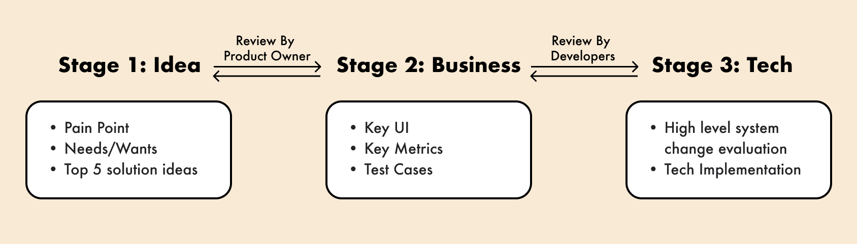
Our team worked on grooming the tickets at the stages 1 and 2, collaborating with business analysts and developers to consider the alignment according to business/technical requirements. Activities, we led include:

Complete quests, earn points and rewards that help you to establish a habit of effective finances management.

Get your spendings categorised and organised in seconds. Plan ahead your major purchases with our customisable AI advisory.
Have key SuiGor performance analytics in the palm of your hand. Filter and sort according to your business needs.
One of the personal challenges during this project was that the product was purely for Cantonese speakers. As a non-Cantonese speaker, the first step in my journey was to understand the product enough to empathise with the real user. Therefore, I asked for the help of my Cantonese-speaking teammate, to go over the product and existing user flows together. Afterward, I continued by emphasising what potential users might face by using the app and identifying common frictions.
We started our project with brainstorming one of the new features - "SuiGor Points", that would increase product stickiness and new users acquisition through gamification.

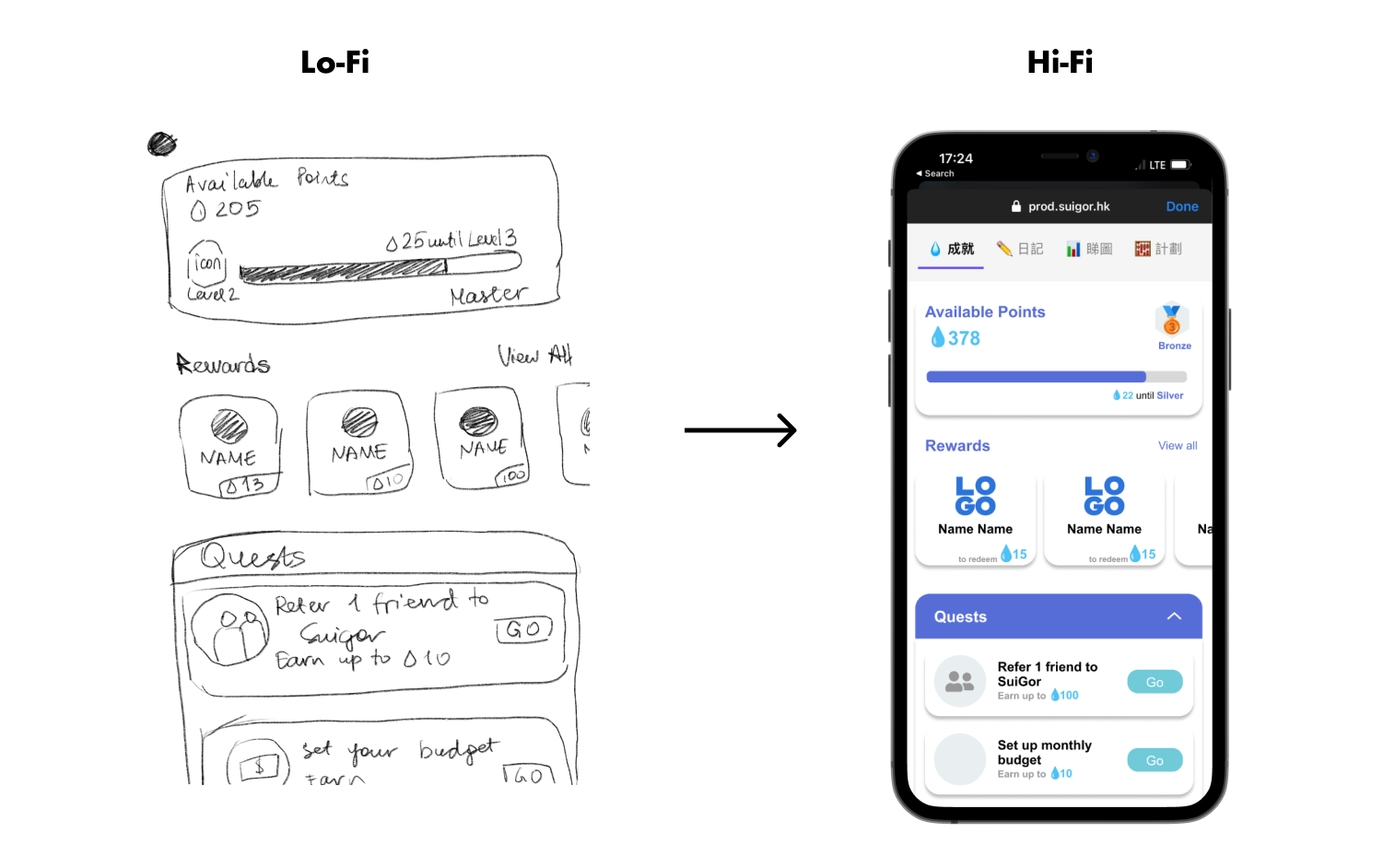
As this was the very beginning of our engagement with the client, and the first ever real product UX/UI development experience for me, I got carried away with visualising the feature in our sketches. However, my mistake was that while we wanted to create fun experience for the user, I did not consider technical difficulty of developing such UX/UI. Below are our first drafts.

Therefore, after I got more familiar with the team's ways of working, as well as technical limitations, I came up with the screens that balance out user, business and technical needs. Below is the latest high-fidelity design for SuiGor points feature that has been approved to go to production after translating UX copy to Cantonese.
As I am writing this case study (04/22), the SuiGor points UI constructed by me is under development.
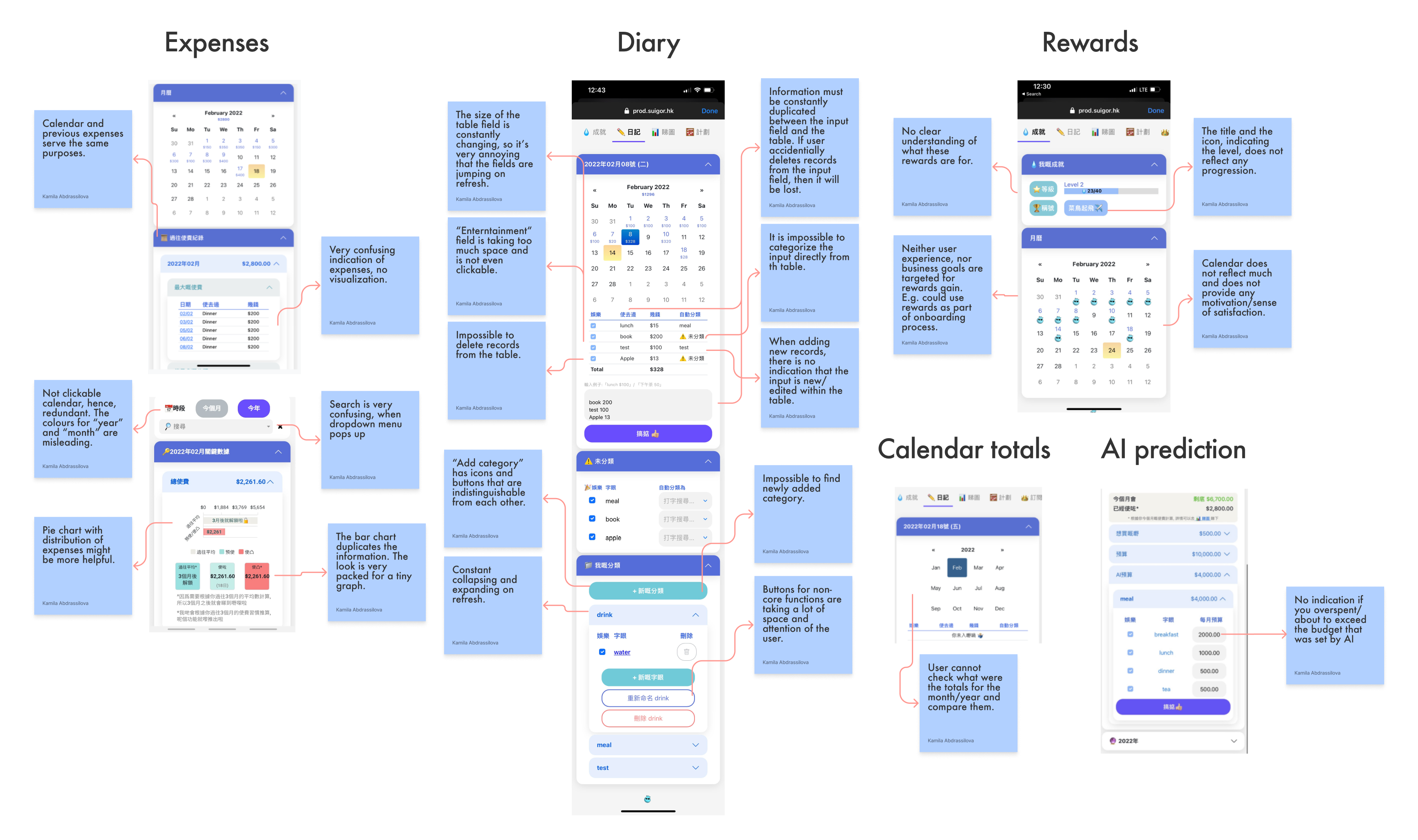
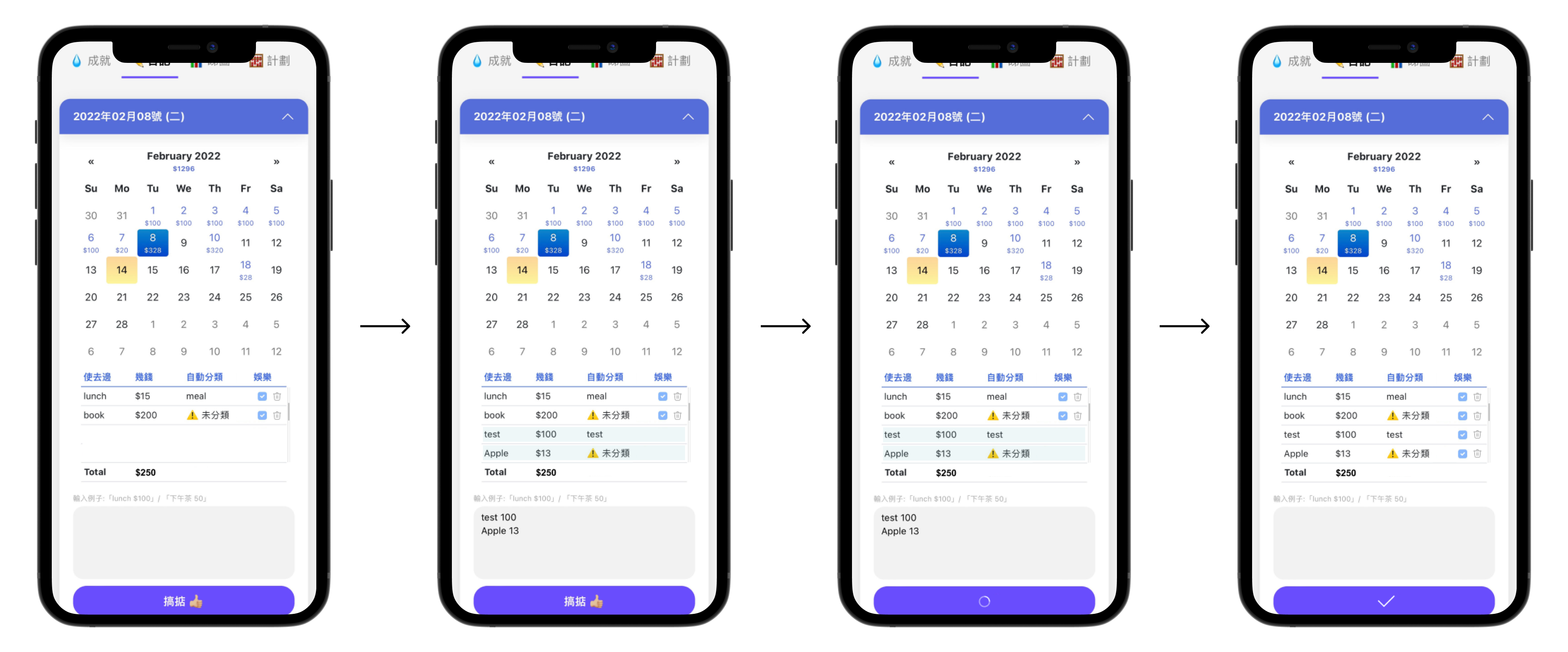
Some of the pain points that we aimed to fix, might have seemed minor at first glance, but greatly impacted the overall user experience. For example, we identified that accordion structure of the app suffers from constant collapsing/expanding of accordions either on refresh or user's input, creating an extra friction. This lead to users confusion, as well as potential errors. Below is one of the examples of how we improved the data input flow, which suffered from collapsing/expanding of calendar on each input.
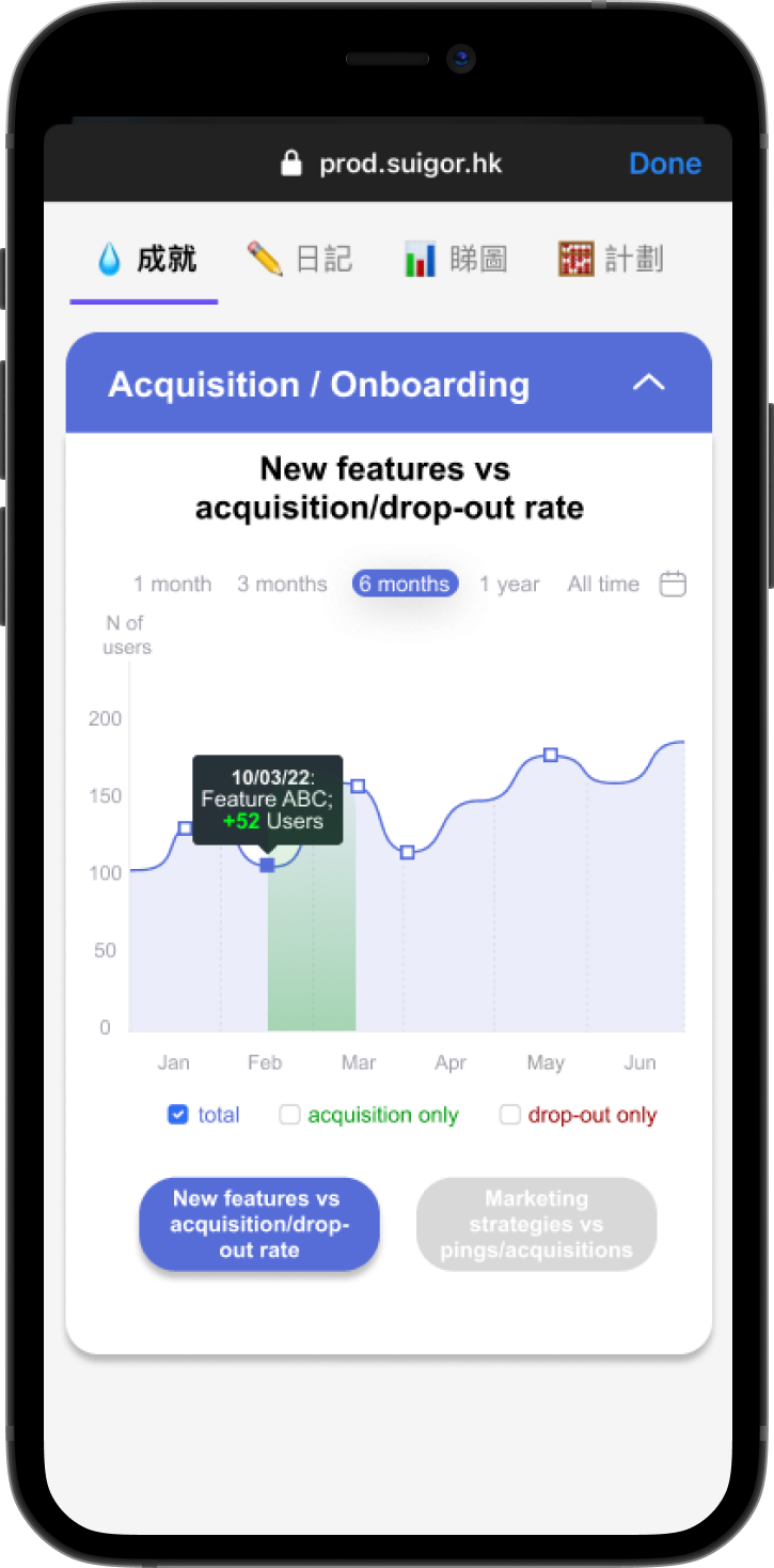
In addition to working on the core app, we were asked to develop UI for an internal mobile dashboard tool. Due to time limitations, instead of conducting research, we were directly given key business analytics that need to be presented in a dashboard, and the client requested for the tool to follow their core app UI design. First, I started brainstorming and sketching what would be the optimal visualisation for the data (e.g. what type of graph, what filters, etc.). Below are the visualisation drafts.

After confirming data visualisation, necessary sorting and filters, I moved on to constructing a detailed sitemap. This helped with identifying the information architecture for the dashboard tool.
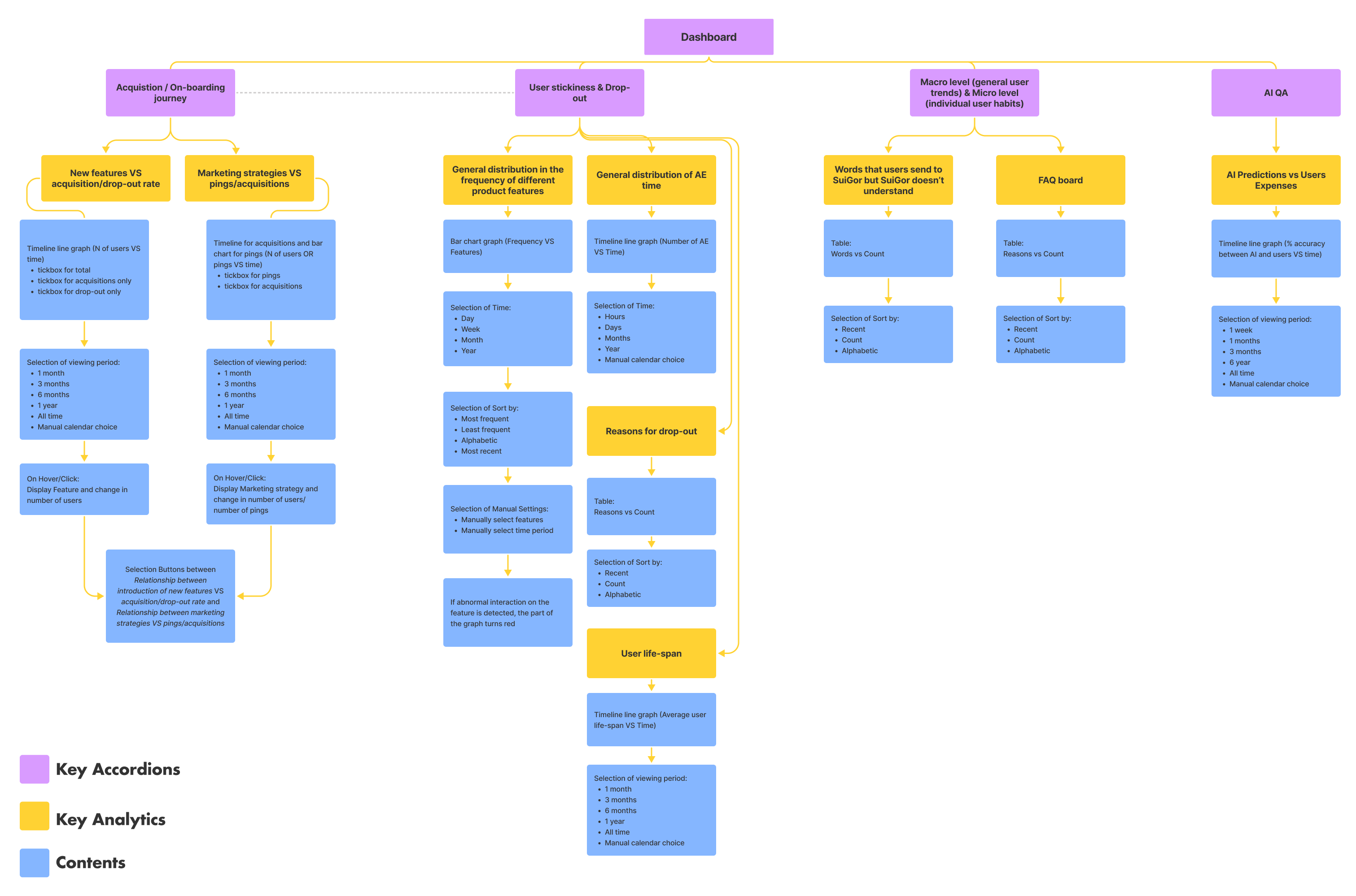
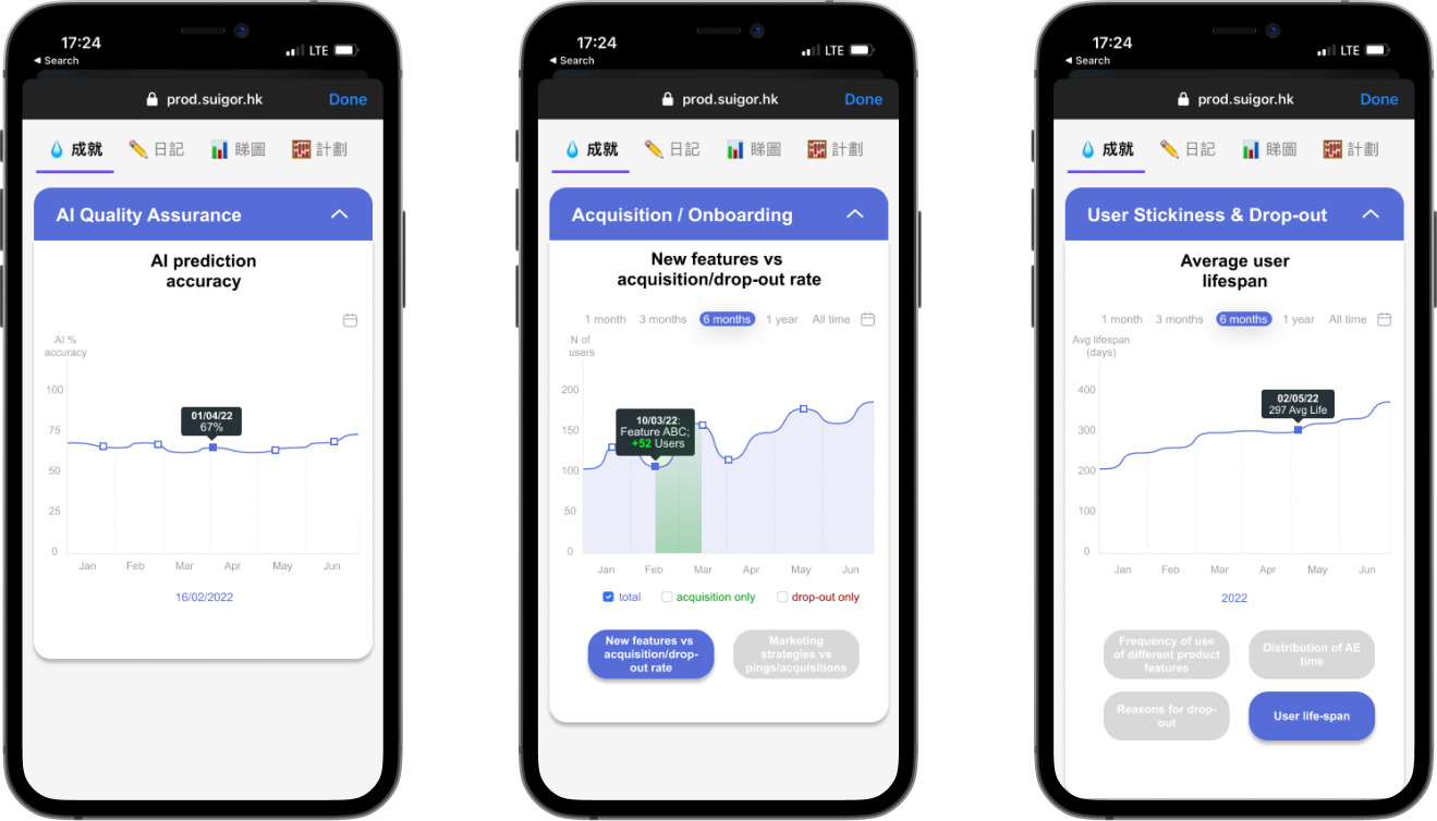
Afterwards, my teammate and I split the construction of high fidelity wireframes. I was responsible for the analytics that require data visualisation in a graph. Below are example screens.
Given the structure of the project, my teammate and I were asked to mainly focus on the UI fixes and proceed with own or team's assumptions. By the end of the project, we highly recommended to conduct usability tests on our prototypes with the real users before deploying them to production, to SuiGor team. To facilitate that, we passed the documentation with all the options we developed and future design suggestions to them.
I learned the importance of BUILDING THE RIGHT THING, before proceeding with BUILDING THE THING RIGHT.
We joined the company in the middle of their Agile sprint, and had to quickly adapt to their style of working. Often design process is represented by the "Double Diamond" but in reality, the process could be messy and full of uncertainty. As SuiGor is an early stage startup, it was important for us to deliver added value to them in the form of wireframes and prototypes. There was no design system or existing reusable components, which potentially slowed down our work. We had to iterate "on the go" and unfortunately did not have time to validate our solutions with the real users.
However, throughout the project, I learned to experiment with different approaches, look for the solutions with a designer's mindset and constantly reflect on past experiences to seek improvement.
Designed and made with Webflow
by Kamila in 2022 ❤️.